Junji Ito is a Japanese comics artist who specializes in horror, most famous for his large-scale works, Spiral, Gyo, and Tomie. Spiral in particular is usually seen as his masterwork, but to my mind his vast output of short stories is even more remarkable. Just coming up with this many appalling ideas, and then finding novel and visually arresting ways for each of them to look horrific, is an astonishing achievement (and/or a sign that Ito needs to go have a glass of warm milk and a lie-down). Even though this post is about horror, everything else on this page is pretty PG — but if you want an unfiltered taste of Junji Ito’s horrific imagination, click here. Or here. Or here. Or here. Or here. DO NOT CLICK THIS ONE. (You clicked it, didn’t you. Jesus, there’s just no warning some people.)
When you open up a Junji Ito book, you do so knowing that you’re going to be confronted with an image like this eventually. The revelation of the horror-image, in fact, becomes a meta-narrative tension that runs throughout the story. When is it going to get crazy? When is it going to get gross? And I’m sure that Ito owes his fame and success to his ability to come up with (and execute), these nightmare visions.
But this post is about a quieter aspect of his technique, and one which — unlike the horror-images linked above — appears not just in one of his comics, but pretty much systematically throughout his work.
I want to talk about how Junji Ito draws eyes.
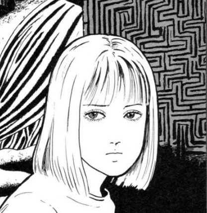
“The Intolerable Maze”
There’s something about the eyes in a Junji Ito drawing that creates a subtle atmosphere of horror even when nothing particularly horrific is happening.

“Hair in the Attic”
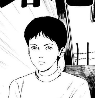
“The Back Alley”
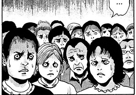
“Hellstar Remina”
You feel it, right?
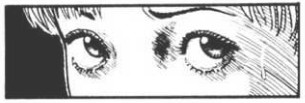
I forgot to label this one when I saved it LOL
I’m not just making this up?
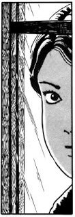
“The Bridge”
There’s something off about the eyes: they’re too pale, too vivid, too liquid.

“The Moaning Drain”
They creep me out.
In some cases, like the last image above, the effect might be biologically determined. People widen their eyes when they’re scared, and we tend to start feeling scared ourselves when we see someone else’s frightened face. (There’s even research that suggests that we’re sensitive to the whites of people’s eyes in particular.) Cartoon eyes in general tend to show huge amounts of white, but when we see more white than USUAL, whatever usual might be, we’re going to interpret that as fear, and we may end up mirroring the emotion.
That said, it strikes me as unlikely that Ito’s art is scary just because he’s good at realistic drawings of frightened people. (If you clicked through to the shock images, you know that Junji Ito is a dude who is not on speaking terms with realism of any kind.) The offness of the eyes is, rather, a matter of expressive distortion: a selective betrayal of realism.
Expressive distortion is a pretty standard aspect of all sorts of visual art. My father (who used to teach drawing and color) would illustrate the technique by showing Mantegna’s “Lamentation Over the Dead Christ.”
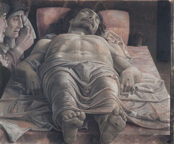
(Which is, like, not NOT horror, come to think of it?)
If you know the basics of perspective, you know there’s something “wrong” with this image. From our vantage point, Christ’s head probably OUGHT to be hidden behind his big toe. But instead it’s nearly as wide as his waist. This isn’t a matter of Mantegna being a talentless hack! Believe me, Andreas Mantegna knew more about perspective than you do. But he’s not going to paint Christ with giant feet and a teeny tiny head! That’s undignified. Christ gets a massive, heroic head because Christ is heroic and massive. Aesthetics (and theology) win out over realism every time.
Expressive distortion is a standard part of the comics artist’s toolkit, and it’s probably used even more frequently in horror comics, where a subtle sense of wrongness is part of the desired effect. The most obvious cases are things like this:
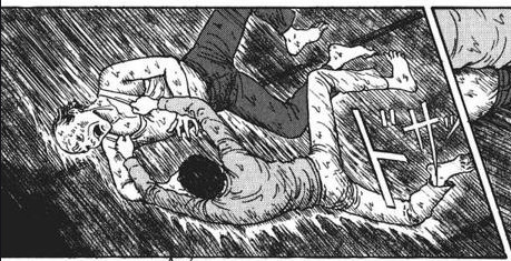
“Glyceride”
Look at the legs of the lower figure. See how his top thigh is too long, when compared to his bottom thigh? If he tried to stand up, he’d fall over! And yet we don’t really read the image that way… On some level we recognize a difference between the thing that’s depicted and the depiction itself — between the body and the ink on the page, as it were — and we understand that the distortion is a feature of the latter. His legs are normal, they’re just drawn weird for expressive effect.
(We should dwell on that for a bit. The distortion is a feature of the ink on the page… but it tells us something about the body. More specifically, it tells us something that you otherwise couldn’t draw directly: i.e. something about the emotional or spiritual state of the body in question. In this case, the twisted body is meant to reveal a twisted mind.)
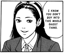
“The Hanging Balloons”
When we look at Junji Ito’s eyes, we’re dealing with more or less the same phenomenon — it’s just a subtler and more unusual case. Take a minute to really look closely at this face in the image above, lingering over each of her features… and then look at it again, and try to stop seeing the features as features. Try to think of them as lines, traces left by a pen sliding across paper. How much work went into each of them? The nose, in particular, is just barely there, right? Whereas the eyes are rich and detailed, with more than a dozen individually delineated eyelashes.
What lighting conditions that would have to exist, to make someone’s face actually look like this? That washed-out hint of a nose implies that she’s standing in front of a full bank of klieg lights… but if the lighting were that intense, you’d never see that much detail on the eyes, nor would she be able to keep them so wide open. So the composition of the face is essentially unrealistic. (Of course, we don’t typically look at a drawing and then try to reverse-engineer the lighting setup. That would be like looking at the Mantegna and thinking “Gee, Christ had acromegaly.” Nevertheless, we recognize the distortion. Or rather, we feel it.)
Making certain parts of the image too bright is a favored technique of Ito’s. There’s often at least a hint of it in his eyes, and sometimes more than a hint. Like here, for instance
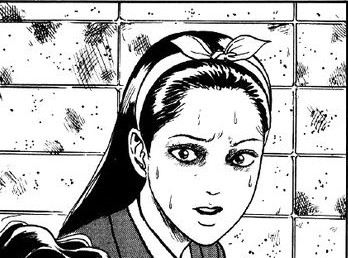
“The Hanging Balloons”
or here.
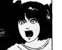
“Hair in the Attic”
But he’s actually more likely to apply this particular distortion to the face as a whole. Like this,
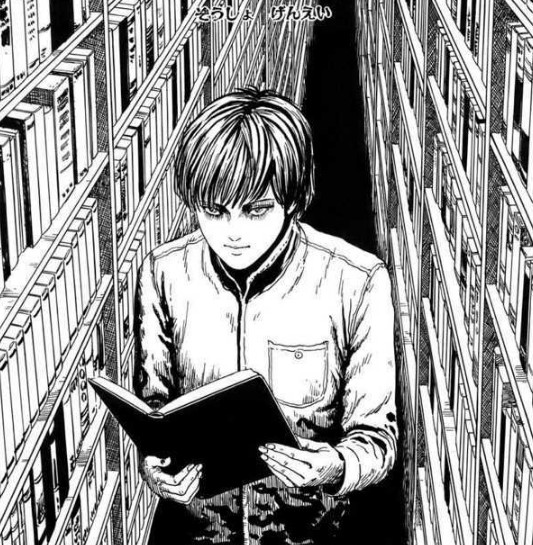
“Library of Illusions”
or like this.
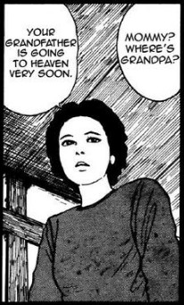
“The Chill”
And this vacant washed-out face — the face as negative space, if you like — makes a particularly vivid frame for the other kind of distorted eye that Ito likes to draw, where instead of a distortion of form (one part is too long, one part is too short) or a distortion of tone (one part is too bright, one part is too dark), we get a distortion of mimetic register: one part, specifically the eye, is drawn in a realist style, while everything around it is drawn in a cartoony style.
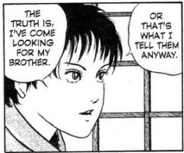
“The Intolerable Maze”
Again, take a minute to really look at every feature of this face. Look at all the detail that went into those eyes! Look how the light reflects from their surface! And then look at that mere suggestion of a nose and a mouth. Can you imagine what it would be like to touch this character’s cheek, or her hair? I mean, obviously you CAN, you all have good imaginations, but does the image really give you anything to go on, on that front? (Does anyone else sort of intuitively think that her cheek would feel like paper?) Now, is it easier or harder to imagine what it’d be like to touch her eyeball?
You might be thinking: okay, yes, Ito seems to draw his eyes really carefully. But eyes are expressive. Isn’t this just a feature of manga, or even just comics? Maybe… but consider these panels from Akira and Dragon Ball.
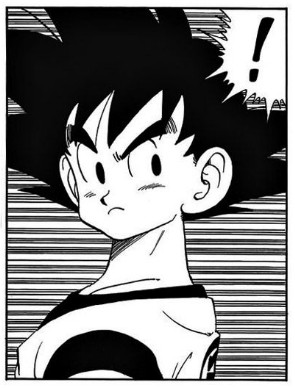
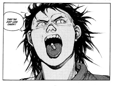
Otomo has a pretty realistic style; Toriyama’s is much more cartoony. But in each case, the eyes — while large — pretty much match the rest of the face. We get a little closer to Ito with something like Ranma 1/2, which is probably the catalog specimen for the “huge anime eyes” style…
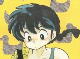
Ranma 1/2
… but although Takahashi definitely spent more time and energy on the eyes than she did on the mouth, they’re nothing realistic about them. She wasn’t going for realism — everything stays in the same mimetic register. (And note that Takahashi plays with mimetic register like a boss when she wants to: think about the way she draws Ryoga in his pig form vs. the way she draws him as a human.) Takahashi’s eyes aren’t realistic, but they don’t feel like an expressive distortion. At least not to me.
It helps that Takahashi’s characters are all drawn the same way: someone who’d never read manga before might well be unsettled by those giant shiny eyes, but after you read a few chapters it just becomes grammatical, like the yellow skin on The Simpsons. This is pointedly not the case for Ito! First of all, his mimetic register is all over the place, ranging from stylized cartoons
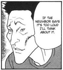
“The Woman Next Door”
to intricately rendered quasi-realism.
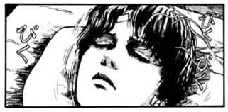
“The Long Dream”
To a certain degree, he uses different styles for different books. But he sometimes juxtaposes them within a single panel, or even — and this is basically what I’ve been trying to say this whole time — in the design of a single character, so that you get real eyes staring out of a cartoon face!
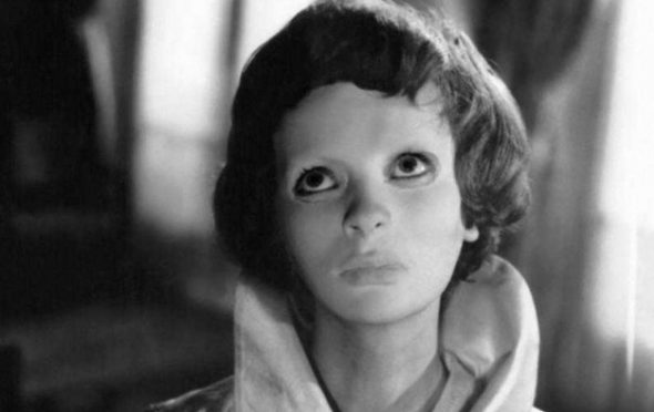
(So basically this, except a drawing.)
But only some of Ito’s characters have special eyes. Most typically, he uses it for people who are witnessing something horrific. And this is particularly interesting because — as you already know, if you clicked on the image links at the top of this post — Junji Ito’s horror-images are ALWAYS drawn in his heightened realist style.
This is a weird paradox! On the one hand, Ito’s horror-images are defiantly surreal. But on the other hand, he draws them as carefully as he possibly can. All of the attributes that we assigned the eyes earlier — the wetness, the roundness, the organicism, the surfeit of detail, the sense of being set off from their surroundings — are also traits of Ito’s horror-images. To an extent this is to be expected. His whole job is to draw stuff that’s scary to look at, so obviously he’s going to make these images the center of attention. But again there’s a degree of distortion. The horrific objects use WAY more ink, they feel much more three-dimensional, they have more half-tones and cross-hatching… they’re never left as hints and suggestions, the way that people’s faces often are. I said I wasn’t going to show you anything scary in this post, but I want to give just one example of a horror-image, so you can see what I’m talking about. For what it’s worth, there’s nothing intrinsically scary about the subject matter here: it’s just a fresnel lens that has overheated and melted down (albeit under the influence of a terrrible cuuuurrrrse).
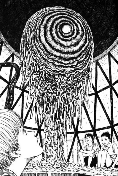
Uzumaki
Notice how much detail and contouring go into this. How organic it looks, for all that it’s literally only glass. And then look at the blank white plane of the character’s face in the foreground. Ito has two artistic registers, the quotidian and the horrific — and it seems like it’s the juxtaposition of the two styles that gives his work its unsettling visual power. And eyes, in Ito, float around in this liminal space between the normal world and the horror world.
Here’s an example from a single panel. The character in the foreground, Mimi, is the protagonist of Mimi no Kaidan, a relatively low-key series based on urban legends. (It’s based on a collection of “real life” ghost stories which, in Ito’s book, all end up happening to this one incredibly unlucky college student.) Her boyfriend, in the background, sees the same things that she sees… but he’s always trying to find some rational excuse to explain them. He doesn’t really witness the horror in the same way that Mimi does — so his eyes are left flat. Hers sparkle.
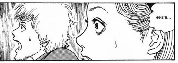
“The Sound of Grass”
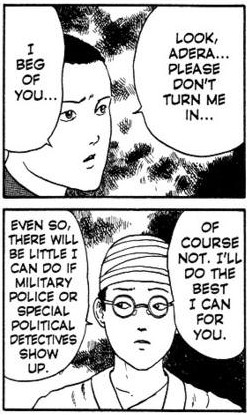
Here’s an example stretched across multiple panels from “A Deserter in the House,” an uncharacteristically mournful and slow-burning story that just might be the best thing that Ito ever made. (It’s the least viscerally shocking thing he’s drawn, but it chilled me the most while I read it.) Without spoiling anything, let’s just say that there is a horrific secret at the heart of the narrative, and that the characters learn about it eventually. Here’s what their eyes look like before they know,
and here’s what they look like after.
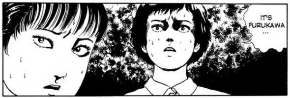
“A Deserter in the House”
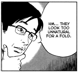
And then there’s “Layers of Fear,” a very Ito-ish fever dream of a story packed with surrealism and body horror. I’ll show you three eyes here: this one is from a side character who never witnesses anything horrific,
this one is from the protagonist, who sees the horror,
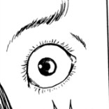
and this one is a carefully cropped excerpt from the horror-image itself.
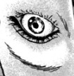
“Layers of Fear”
It’s striking: the observer’s eye seems to take all of these traits that I’ve been talking about to the absolute limit — and then the victim’s eye blows it right out of the water. It’s even more glistening, more rounded, more detailed, and the rest of her face even has skin tone (which is vanishingly rare in manga in general, and rarer still in Ito’s work). And then you see how the oblivious bystander basically just gets cartoon eyes?
Witnessing horror, in the work of Junji Ito, means getting infected by it. Your eyes, the organs of vision, become… permeable. Liquescent. Organic. And the horror enters in.
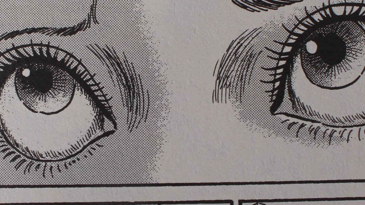
Nice analysis. A couple other things I think are going on here: the selective distortion plays with the way your eyes move around the page. With the Christ figure, shrinking the feet kind of forcefully mimics what your eyes would be doing anyway, looking at Jesus’ face rather than staring at his feet.* It also gives a sense that you’re focusing your gaze from a distance, rather than being two inches from his toes–as you would if you *really* want to see his face. With the guy with the long leg it adds to the feeling of motion. With Ito’s eyes, the greater detail there is essentially forcing you to stare HARD into their eyes–because it’s only the area right around the central point of your vision, where you’re focusing, in which you actually see sharp detail–most of your field of vision is much less clear and seeing it sharply depends on your eyes moving around a bit. It’s as if your eye is prevented from wandering around the page like it normally would if you weren’t in a state of shocked horror.
The added detail also makes the eyes look worn and weary compared to the rest of the faces. Like, ‘I may be physically young but I just aged 10 years watching that freznel lens melt’ or whatever.
* I mean I guess it depends on how you’re reacting. You could stare at his feet hypothetically, that seems kind of impious and a little creepy though…?
This is a really good point! The drawings (and the Mantegna) all have really interesting composition/layout, and your eyes are usually guided right to the critical part of the image. I love how in the picture from “The Chill,” he got both the shading and the cross-hatching on the roof in the background to sort of focus in on the blank white face in the foreground.
From what title are the very first pair of eyes from? I really need to know. Thank you, excuse my bad english.
I thiiiiink it’s from Uzumaki but I lost the metadata for that one, and Uzumaki is a little too long for me to go back and check.
Spectacular article. I’m making a Junji Ito video for my Youtube channel, so I used a bit of this stuff for sure. Of course, citing the source. I’m still from Argentina, I doubt that this has any importance, but hey.
Greetings from the south of the planet!