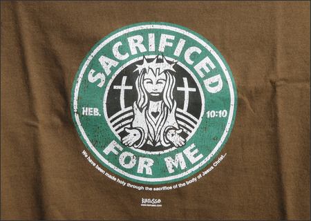
Wrather (really? that guy still writes for the site?): Christianity

The best logo in the world—one could argue, the most recognizable symbol of anything anywhere (though this is not the basis of my claim that it is the best)—is the Christian cross. My argument for this is not based on religion in the slightest—I make no claim he re for any theism, atheism, or -ism of any kind. It’s not based on the ubiquity of the cross, nor on its total identification with the institution(s) it stands for, nor for any value or belief it may seem to symbolize. It’s based on the fact that the cross is not a symbol at all.
As an instrument of contemporary ideas about branding, logo design relies on our conscious and subliminal associations. A logo prompts certain thoughts, hopefully positive, that are then associated with the product or service being represented. The bold, curvilinear Nike swoosh connotes dynamic movement and graceful fluidity. These are qualities to which athletes aspire, and the product—athletic shoes—is meant to fulfil them.
The Starbucks logo is nautically themed (FWIW, Stokes, Starbuck was the coffee-loving first mate in Moby Dick), and connotes luxury and indulgence (not the least, I think, because it’s a circular portrait framed in green—like money). We are mean to associate this luxury and this sense of escape and tame adventure (ever notice how many of the Bux’s coffee labels used to look like safari billboards?) with overpriced, overcooked coffee. (Don’t get me wrong. I love Starbucks. And Vampire Weekend. And my MacBook. Take that Belinkie.)
The cross doesn’t symbolize anything. The right angles at which its lines intersect do not connote a love of orthoganality. It’s not a symbol… it’s a picture. It’s an illustration. It’s a representative drawing. Specifically, it’s a drawing of the means of capital punishment used in the far reaches of the Roman empire during the early part of the common era. (Let’s pause for at least a moment and reflect on the profound strangeness of this. Imagine a religion that took as its logo the electric chair or the syringe.)
Christians believe that Jesus died this way before his resurrection, so the drawing is meant to stand for part of the story. This works both by metonymy—the cross is closely associated with Christ, who gives Christianity its name, because he was executed on one—and by synecdoche—crucifixion is one part of the ressurection.
What I’m saying is that the meaning—and, though the cross is not a symbol, I think we can agree it has many meanings—is arrived at ex post facto. Without Nike, the swoosh is still dynamic and graceful. Without Christ and the resurrection, the Cross means nothing. It is totally identified with what it represents, so much so that “representation” doesn’t seem adequate to describe the relationship. It’s transcendent—and not just because it’s religious. And that’s why it’s the best.
I mean, seriously… could you even imagine the alternative?

I tried to avoid controversy. I really did.
Want to write one in? Leave a comment below!
Good symbols should not be bastardizable (that a word?). The Christian cross is to simple. It has been tweaked, perverted, adorned or otherwise adapted to the subdivision of Christianity.
The Red Cross gets major points for universality and it will likely win because it is most recognizable versus best all around.
American Apparell is just ripping off the Gap from the 80’s(? – egads was it that long ago). Sun has a good logo, just like Nabisco and Nike, but it’s just good.
Which leaves Starbucks. The damn thing is so unique, ubiquitious, and uniformly represented that it beats the Red Cross. Sure, we associate the Red Cross with video game powerups. Did you know that they are in charge of getting messages to military members on the front lines? Did you know that they shot into fame by helping out at the Jamestown flood, by bringing both supplies and a PR crew. They do blood drives, they do so many things that people don’t think about instantly.
Green Mermaid lady -> instantly we think ofcoffee, wifi, music, done.
I wish I knew you folks were actually writing up the worst logo, because I would have chimed in. The worst logo is clearly the universal radiation warning sign. It is, in fact, so ineffective a logo (from certain angles it looks like an angel), that the U.S. Department of Energy and the EPA spent years trying to replace it with something that better signified, “Stay away from this shit! It will melt your eyes!”
Check it: http://www.damninteresting.com/?p=160
I’ve been a big fan of the Sun logo for years, for precisely the reasons mentioned. The argument for the Red Cross was compelling, though.
@Wrather: I know Starbuck is from Moby Dick, but I didn’t remember that he had a coffee fixation. Incidentally, the Starbucks people were originally planning on calling their store either Pequod or Moby’s Coffee, depending on which account you read. I do like the fact that, thanks to the ubiquity of Starbucks coffee, all three mates in Moby Dick are now named after chemical dependencies (the other two being Stubb (i.e. of a cigar) and Flask (i.e. of hooch.)
@Mlawski: You’re totally right. Now, the international biohazard symbol, on the other hand – you know, the one they put on medical waste and the like – that one looks like it would slice you up reeaal good, just for making eye contact.
What about the Jesus Fish, then?
I would have voted for SBux, but apparently I missed the deadline. Where are the results?
My vote goes for Christianity’s Cross. The Red Cross was close, though, The Jesus Fish is a symbol, and thus lacks the power that puts the crucifixion’s cross at the top.
Sun Microsystems strange shapes actually looks like S’s, but are also obviously U’s and N’s. Holy Crap!