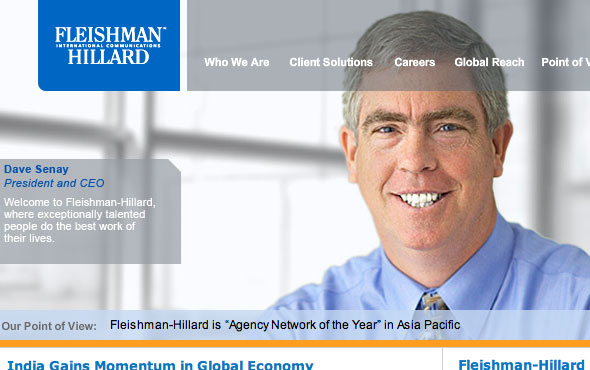
Photoshop Disasters, a blog devoted to the misapplication of Photoshop and image manipulation, excels at delivering the best in disproportionate body parts, missing limbs, and just plain production slopiness. But this entry stood out to me not for a mangled photo-manipulation job, but for the insanity that lurks behind it:
Clearly, the teeth and the smile are messed up, and that’s what makes this a “Photoshop Disaster.” But look at all of the website copy that’s visible in this crop:
- In between the company’s name: “International Communications.”
- Menu options: “Who We Are,” “Client Solutions,” “Careers,” “Global Reach,” and “Point of View.”
- President and CEO’s welcome message: “Welcome to Fleishman-Hillard, where exceptionally talented people do the best work of their lives.”
- “Our Point of View” news ticker: “Fleishman-Hillard is ‘Agency Network of the Year’ in Asia Pacific.”
It’s no big surprise that this turns out to be a website for a PR and Marketing firm, but all the same, I couldn’t help but see this as a huge steaming pile of generic-corporate-mumbojumbo-vaporware-smokeandmirrors bullshit. A dark mirror to the emptiness and lack of true productive value of American corporatism over the last few decades.
Americans don’t make things anymore. They make generic slogans and stock photography that market other generic slogans that sell more generic slogans. And that is the true disaster.

So how would you have *your* website look if you had a company like theirs?
I wonder if they realised they made that guy look like the Joker in Tim Burton’s version of Batman?
Imagine what he must have looked like before if this Photoshop job was the best work of someone’s life!! :-O